
Responsive web design, which delivers an optimized version of your website to a device based on screen size, is a top trend for 2014. Already sweeping the nation’s businesses, responsive design is going to be a make or break step for businesses, Forbes reports. More than a hot buzzword, responsive design is a challenging yet necessary next step. The EXTEND GROUP presents five steps to generate a responsive web design. Our technology services can support your business through this transition.
Benefits of Responsive Design
Responsive design focuses on maintaining a fluid design across devices, ensuring a seamless customer experience. Its chief benefit is delivering a better-looking customer experience with less fuss. While the initial setup is time-intensive, your developers won’t need to be constantly tweaking the site post-launch. This leaves them free to focus on other projects.
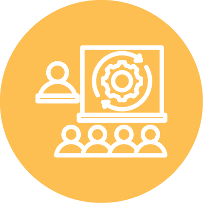
5 Steps to a Responsive Design:
- Plan your content – Just as in planning for a traditional website, you’ll need to think about page elements, navigation, and types of content. In responsive design, wireframes work well for prototyping the customer experience across devices quickly yet effectively.
- Design your content with screen sizes in mind – Traditional design time would focus on creating a perfect mockup. Responsive design generates a few sketches that can be used to make high-level decision on page formatting, element display, and content. It’s worth keeping in mind here that you don’t need to present all of your content on every page rendering. Keep in mind the user’s needs and deliver a device-specific page design to meet those needs.
- Find workarounds to device-specific and content-specific problems – Constraints will arise — for example, finding ways to integrate ads across devices without overwhelming content. At this point, identify roadblocks and find solutions to obstacles.
- Test and re-test – In traditional design, testing comes at the end and is seen as a “one and done.” In responsive design, you’re constantly testing implementation and acting upon insights gleaned. Testing as you go across browsers allows early detection of problems and saves time.
- Revise – When issues arise, act upon them by revising the design, then testing again. By rigorously testing and revising the prototype, you end up with a stronger final product that responds better to user needs.
Because the EXTEND GROUP’s team is well-versed in both the requirements of responsive design and the agile approach to technology integration, EXTEND GROUP can help you refocus your web strategy toward a more responsive design. Learn more about the technology services we offer.


